 Program development > Css > Content
Css Translate examples, with box and text center horizontally and vertically
A new animation function has added in CSS3, it's an animation, it's indispensable to move, so the Translate is increased accordingly. It is mainly used to control the movement of objects. It can be divided into Translatex() and Translatey(). The former controls the object to move along the X axis, and the latter controls the object to move along the Y axis. The Translate can control the object to move along the X axis and Y axis, of course, can also control the object to move along X and Y at the same time.
Translate is a relatively simple property in transform. It can set up to two values at most, which is relatively easy to understand. If you has CSS foundation. Basically, you can understand it by looking at an example. The following briefly introduces the syntax rules of Translatex(), Translatey(), and Translate(), and then gives an application example, respectively.
I. Grammar rules of object translation
1. Grammar rules of Translatex
translatex(<translation-value>)
The translation of the object along the X axis is set by Translatex. The translation-value in the expression is the value of the translation of the object along the X axis, such as 100px.
2. Grammar rules of Translatey
translatey(<translation-value>)
The translation of the object along the Y axis is set by Translatey. The translation-value in the expression is the value of the translation of the object along the Y axis, such as 100px.
3. Grammar rules of Translate
translate(<translation-value>[,<translation-value> ? ])
The first translation-value in the expression is the value of the object's translation in the X-axis direction and cannot be omitted; the second translation-value is the value of the object's translation in the Y-axis direction and can be omitted.
II. Css Translate, Translatey and Translate application examples
1. Example of Css Translatex
html code:
<div class="translatex">Css transition translatex 100px</div>
Css style:
.translatex{transform:translatex(100px);border:1px solid #b29b9b;width:300px;height:100px;background-color:#e0deda; padding:8px;}
Effect picture:
As you can see from the effect picture, the div is translated by 100 pixels along the X axis (right).
2. Example of Css Translatey
html code:
<div class="translatey">Css transition translatey 100px</div>
Css style:
.translatey{transform:translatey(100px);border:1px solid #b29b9b;width:300px;height:100px;background-color:#e0deda; padding:8px;}
Effect picture:
The div is translated by 100 pixels along the Y-axis (downward).
3. Example of Css Translate
html code:
<div class="translate">Css transform translate (100px, 100px)</div>
Css style:
.translate{transform:translate(100px, 100px);border:1px solid #b29b9b;width:300px;height:100px;background-color:#e0deda; padding:8px;}
Effect picture:
The div is translated by 100 pixels in both the X-axis and Y-axis directions.
4. Translate center css(i.e. Css translate to center of screen)
html code (rounded rectangle is Centered):
<!DOCTYPE html>
<html>
<head>
<meta charset="utf-8" />
<title>Css translate</title>
<style type="text/css">
.box{border:1px solid #b29b9b;width:300px;height:100px;background-color:#e0deda; padding:8px;}
.translateCenter {
position:absolute;
top:50%;
right:50%;
border-radius:4px;
-webkit-transform:translate(50%, -50%); /* Webkit kernel browser (Chrome/Google and Safari/Apple) */
-ms-transform:translate(50%, -50%); /* IE(edge) kernel browser */
-moz-transform:translate(50%, -50%); /* Firefox kernel browser */
-o-transform:translate(50%, -50%); /* Opera kernel browser */
transform:translate(50%, -50%); /* W3C standard browser */
}
</style>
</head>
<body>
<div class="box translateCenter">Css translate to center of screen</div>
</body>
Effect picture:
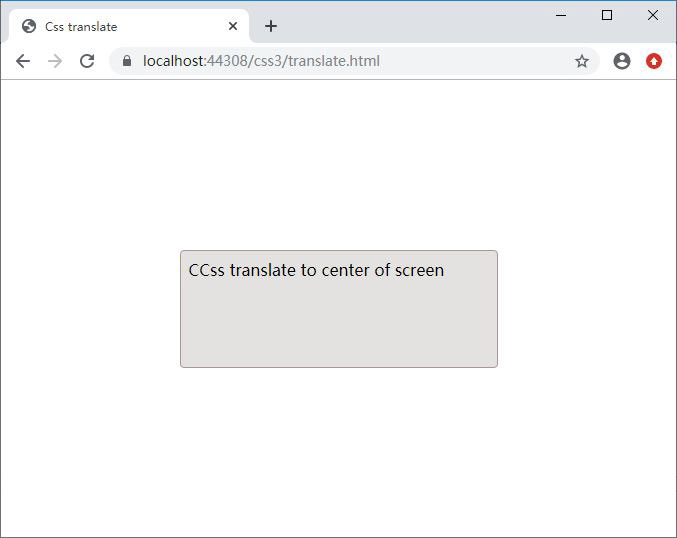
If you change right:50% to left:50%, transform:translate(50%, -50%) should be changed to transform:translate(-50%, -50%); because for Translate, positive numbers mean right, the negative number indicates the left. For top and bottom, positive numbers indicate up, and negative numbers indicate down.
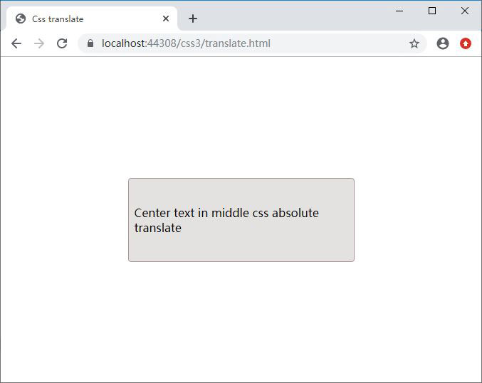
Center text in middle css absolute translate
Just define another Css that centers text in middle based on the above, namely:
.center {
display:flex;
justify-content:center; /* Align horizontal */
align-items:center; /* Align vertical */
}
Referencing the CSS, namely:
<div class="box translateCenter center">Center text in middle css absolute translate</div>
Effect picture:
-
Related Reading