Program development > Css > Content
Css transition background color highlight, gradient changes or transition left to right
Before CSS 3, the highlight or backlighting can also be realized when the mouse through the background, but it is only a simple change of color or a picture. After adding the transition property in CSS 3, you can set excessive animation effects, duration, and properties involved in the transition, make the transition effect rich.
There are many properties involved in the value of transition. This article is only a brief introduction to commonly used properties. Each propertie also needs to be specifically introduced and listed with corresponding examples. Of course, in order to facilitate you can define your own transition effects after reading this article. After introducing the grammar rules of transition, examples of different effects will be listed.
I. Syntax of transition
transition: <single-transition>[, <single-transition> * ]
<single-transition> = none | <single-transition-property> || <single-transition-duration> || <single-transition-timing-function> || <single-transition-delay>
II. Syntax description
1. Set multiple groups of transition effects
A. <single-transition> represents the first group of transition effects, which cannot be omitted;
B. <single-transition> in [] represents the second group transition, which can be omitted;
C. * represents the third group, fourth group, ... nth group transition effect, can be omitted.
2. The values of <single-transition> are as follows:
A. None: means no transition effect;
B. <single-transition-property>: Set the properties involved in the transition in the object, which can be all, background-color, background-image, color, etc .;
C. <single-transition-duration>: Set the transition duration;
D. <single-transition-timing-function>: Set the transition animation type, which can be linear (linear transition), ease (smooth transition), ease-in (from slow to fast), ease-out (from fast to slow) , ease-in-out (from slow to fast to slow), etc .;
E. <single-transition-delay>: Set the transition delay time, which can be omitted;
III. Css transition background color change on hover(highlight or backlighting)
1. Div example
html code:
<div class="transition">
<div class="linear">Css change background color on hover transition in div: linear</div>
</div>
Css code:
<style type="text/css">
.transition{width:310px;height:130px;}
.linear{width:300px;height:80px;text-align:center;padding:6px;border:1px solid #ab9595;background-color:#d4d3d3;transition:background-color .6s linear;}
.transition div:nth-child(1):hover{background-color:#f8a1df;}
</style>
Effect picture:
2. ul li example
html code:
<ul class="transitions">
<li class="easeli">Css change background color on hover transition in div ul li: ease
transition:background-color .3s ease;</li>
<li class="ease-inli">Css change background color on hover transition in div ul li: ease-in
transition:background-color .5s ease-in .5s;</li>
<li class="ease-in-outli">Css change background color on hover transition in div ul li: ease-in-out
transition:background-color .8s ease-in-out .4s;</li>
</ul>
Css code:
<style type="text/css">
.transitions{overflow:hidden;margin:0px;padding:0px;list-style:none;}
.transitions li{width:510px;height:80px;margin-bottom:10px;padding:6px;border:1px solid #ab9595;background-color:#d4d3d3;}
.transitions li.easeli{transition:background-color .3s ease;}
.transitions li.ease-inli{transition:background-color .5s ease-in .5s;}
.transitions li.ease-in-outli{transition:background-color .8s ease-in-out .8s;}
.transitions li:nth-child(1):hover{background-color:#f1d61d;}
.transitions li:nth-child(2):hover{background-color:#05db0f;}
.transitions li:nth-child(3):hover{background-color:#fc072a;}
</style>
Effect picture:
- Css change background color on hover transition in div ul li: ease
transition:background-color .3s ease; - Css change background color on hover transition in div ul li: ease-in
transition:background-color .5s ease-in .5s; - Css change background color on hover transition in div ul li: ease-in-out
transition:background-color .8s ease-in-out .4s;
IV. Css transition display dynamically submenu
html code:
<ul>
<li class="category">
<h3>category1</h3>
<ul>
<li>Item 1</li>
<li>Item 2</li>
<li>Item 3</li>
</ul>
</li>
<li class="category">
<h3>category2</h3>
<ul>
<li>Item 1</li>
<li>Item 2</li>
<li>Item 3</li>
</ul>
</li>
</ul>
Css code:
<style type="text/css">
.category {overflow:hidden; list-style:none; padding:0px; width:180px; height:auto;}
.category h3{height:34px;margin:0px;}
.category ul {position:relative; display:none; float:left; margin-left:-6px; visibility:hidden; opacity:0s; transition:visibility 0s, opacity 0.5s ease;}
.category:hover ul {display:block; visibility:visible; opacity:1;}
</type>
Effect picture:

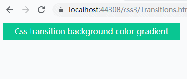
V. Css transition background color gradient changes
html code:
<div class="bgLinear">Css transition background color gradient changes</div>
Css code:
<style type="text/css">
.bgLinear{width:360px height:34px; line-height:32px; display:inline-block; color:#fff; background:#0ac692; text-align:center; margin:0px auto; cursor:pointer;}
.bgLinear:hover{background:linear-gradient(to right, #0ac692 0%, #b201fe 100%, transparent 50%);}
</type>
Effect picture:
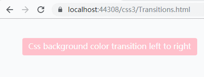
VI. Css background color transition left to right
html code:
<div class="bgt">Css background color transition left to right</div>
Css code:
<style type="text/css">
.bgt{position:relative; margin:40px; width:360px height:36px; text-align:center; line-height:34px; color:#fff; font-size:16px; cursor:pointer; border-radius:4px; background:pink;}
.bgt:before, .bgt:after{content:''; position:absolute; top:0; left:0; width:0; height:100%; z-index:-2; background:pink; border-radius:4px;}
.bgt:hover{z-index:1; background:transparent;}
.bgt:before{z-index:-1; background:#fb9dc7; transition:.6s;}
.bgt:hover:before, .bgt:hover:after{ width:100%; }
</type>
Effect picture: