
CSS3 鼠标经过背景高亮/反亮显示(transition语法规则及div/ul li实例)
CSS3 之前,鼠标经过背景高亮/反亮显示也可以实现,但只是简单的换种颜色或换一张图片,CSS3 新增 transition 属性后,可以设置过度的动画效果、持续时间、参与过渡的属性,使过渡效果变得丰富起来。
transition 的取值涉及的属性比较多,本篇只是大概的介绍常用的属性,每一个属性还要作具体介绍和列举相应的实例;当然为便于看过本文后就能定义自己所需过渡效果,介绍完 transition 的语法规则后会列表不同效果的实例。
一、transition语法规则
transition:<single-transition>[, <single-transition> * ]
<single-transition> = none | <single-transition-property> || <single-transition-duration> || <single-transition-timing-function> || <single-transition-delay>
二、语法说明
1、transition 可以设置多组过渡效果
A、<single-transition> 表示第一组过渡效果,不能省略;
B、[]中的 <single-transition> 表示第二组过渡,可以省略;
C、* 表示第三组、第四组、……第n组过渡效果,可以省略;
2、<single-transition> 取值分别如下:
A、none:表示不用过渡效果;
B、<single-transition-property>:设置对象中参与过渡的属性,可为 all、background-color、background-image、color 等;
C、<single-transition-duration>:设置过渡持续时间;
D、<single-transition-timing-function>:设置过渡动画类型,可为 linear(线性过渡)、ease(平滑过渡)、ease-in(由慢到快)、ease-out(由快到慢)、ease-in-out(由慢到快再到慢)等;
E、<single-transition-delay>:设置过渡延迟时间,可以省略;
三、CSS3 鼠标经过背景高亮/反亮显示transition实例
1、div 实例
html代码:
<div class="transition">
<div class="linear">div背景过渡动画效果:linear(线性过渡)</div>
</div>
CSS代码:
<style type="text/css">
.transition{width:340px;height:130px;}
.linear{width:330px;height:80px;text-align:center;padding:6px;border:1px solid #ab9595;background-color:#d4d3d3;transition:background-color .6s linear;}
.transition div:nth-child(1):hover{background-color:#f8a1df;}
</style>
效果图:
2、ul li 实例
html代码:
<ul class="transitions">
<li class="easeli">ul li 背景过渡动画效果:ease(平滑过渡)transition:background-color .3s ease;</li>
<li class="ease-inli">ul li 背景过渡动画效果:ease-in(由慢到快)transition:background-color .5s ease-in .5s;</li>
<li class="ease-in-outli">ul li 背景过渡动画效果:ease-in-out(由慢到快再到慢)transition:background-color .8s ease-in-out .4s;</li>
</ul>
CSS代码:
<style type="text/css">
.transitions{overflow:hidden;margin:0px;padding:0px;list-style:none;}
.transitions li{width:390px;height:80px;margin-bottom:10px;padding:6px;border:1px solid #ab9595;background-color:#d4d3d3;}
.transitions li.easeli{transition:background-color .3s ease;}
.transitions li.ease-inli{transition:background-color .5s ease-in .5s;}
.transitions li.ease-in-outli{transition:background-color .8s ease-in-out .8s;}
.transitions li:nth-child(1):hover{background-color:#f1d61d;}
.transitions li:nth-child(2):hover{background-color:#05db0f;}
.transitions li:nth-child(3):hover{background-color:#fc072a;}
</style>
效果图:
- ul li 背景过渡动画效果:ease(平滑过渡)
transition:background-color .3s ease; - ul li 背景过渡动画效果:ease-in(由慢到快)
transition:background-color .5s ease-in .5s; - ul li 背景过渡动画效果:ease-in-out(由慢到快再到慢)
transition:background-color .8s ease-in-out .4s;
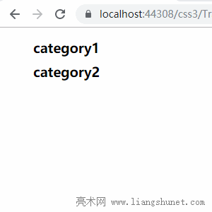
四、用 transition 实现动态显示子菜单
html代码:
<ul>
<li class="category">
<h3>category1</h3>
<ul>
<li>Item 1</li>
<li>Item 2</li>
<li>Item 3</li>
</ul>
</li>
<li class="category">
<h3>category2</h3>
<ul>
<li>Item 1</li>
<li>Item 2</li>
<li>Item 3</li>
</ul>
</li>
</ul>
CSS代码:
<style type="text/css">
.category {overflow:hidden; list-style:none; padding:0px; width:180px; height:auto;}
.category h3{height:34px;margin:0px;}
.category ul {position:relative; display:none; float:left; margin-left:-6px; visibility:hidden; opacity:0s; transition:visibility 0s, opacity 0.5s ease;}
.category:hover ul {display:block; visibility:visible; opacity:1;}
</type>
效果图:
五、背景颜色渐变切换
html代码:
<div class="bgLinear">背景颜色渐变切换</div>
CSS代码:
<style type="text/css">
.bgLinear{width:200px height:34px; line-height:32px; display:inline-block; color:#fff; background:#09c692; text-align:center; margin:0px auto; cursor:pointer;}
.bgLinear:hover{background:linear-gradient(to right, #09c692 0%, #b200ff 100%, transparent 50%);}
</type>
效果图:

六、背景颜色从左到右切换
html代码:
<div class="bgt">背景颜色从左到右切换</div>
CSS代码:
<style type="text/css">
.bgt{position:relative; margin:40px; width:200px height:36px; text-align:center; line-height:34px; color:#fff; font-size:16px; cursor:pointer; border-radius:4px; background:pink;}
.bgt:before, .bgt:after{content:''; position:absolute; top:0; left:0; width:0; height:100%; z-index:-2; background:pink; border-radius:4px;}
.bgt:hover{z-index:1; background:transparent;}
.bgt:before{z-index:-1; background:#fa9cc6; transition:.6s;}
.bgt:hover:before, .bgt:hover:after{ width:100%; }
</type>
效果图:

-
相关阅读
- CSS3 大小缩放scale()scalex()scaley(
- Excel Search函数和SearchB函数模糊查找的用法1
- Excel Find函数和FindB函数使用方法的10个实例,含
- Excel乘法函数Product与*/用于计算乘除法的10个实
- Excel高级筛选的7个使用实例,含不等于空、多条件、筛
- CSS3 Filter 滤镜透明效果应用实例
- Excel Indirect函数用法的7个实例,含跨表跨文档
- CSS3 text-shadow语法规则及上下左右文字阴
- C# Split用法及实例
- Excel Left函数和LeftB函数使用方法的9个实例,含
- CSS3 旋转 rotate3d()rotatez(
- Excel排序的11个实例,含多条件、按单元格与字体颜色