 Program development > Css > Content
Css rotate image, background image and text only, with syntax and on hever
There are many ways to convert objects In CSS3, one of which is rotating, which mainly rotates around the X axis or Y axis, so rotate() must be subdivided into rotatex() and rotatey(), the former is used to set the object rotates around the X axis, the later is used to set the object to rotate around the Y axis.
The rotate can control both 2D and 3D rotation of objects. This article first introduces the grammar rules and application examples of 2D rotation, and then introduces the situation of 3D rotation in subsequent chapters. Let's first look at the syntax rules of rotatex(), rotatey() and rotate(), and then look at their application examples.
I. Object rotation syntax rules
1. Syntax of rotatex
rotatex(<angle>)
Set the object to rotate along the X axis by rotatex, angle in the expression is to set the rotation angle of the object around the X axis, such as 50deg.
2. Syntax of rotatey
rotatey(<angle>)
Set the object to rotate along the Y axis by rotatey, and angle is the angle at which the object rotates around the Y axis, such as 80deg, which cannot be set to 90deg, otherwise the value is invalid.
3. Syntax of rotate
rotate(<angle>)
Rotate can be only set an angle, not both the X axis and Y axis.
II. Application examples of rotatex, rotatey and rotate
1. rotatex
html code:
<div class="rotatex">transform:rotatex(180deg);</div>
Css:
.rotatex{transform:rotatex(180deg);border:1px solid #ab9595;width:200px;height:80px;background-color:#e3e2e0; padding:10px;}
Effect picture:
It can be seen from the effect picture that the text is rotated by 180 degrees; if the angle is set to 50 deg, the div and text are not rotated, but are flattened.
2. rotatey
html code:
<div class="rotatey">transform:rotatey(180deg);</div>
Css:
.rotatey{transform:rotatey(60deg);border:1px solid #ab9595;width:200px;height:80px;background-color:#e3e2e0; padding:10px;}
Effect picture:
As you can see from the picture, the div and text are compressed horizontally and are not rotated.
3. rotate
html code:
<div class="rotate">transform:rotatey(180deg);</div>
Css:
.rotate{transform:rotate(60deg);border:1px solid #ab9595;width:200px;height:80px;background-color:#e3e2e0; padding:10px;}
Effect picture:
Both the div and text are rotated by 60 degrees, along the vertex in the lower left corner.
III. The extended application of Css rotate
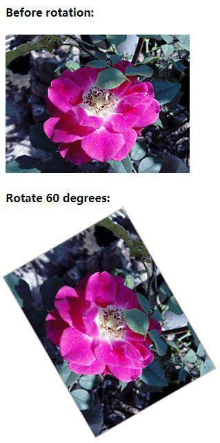
1. Rotate image Css
html code:
<div>
<h4>Before rotation:</h4>
<img src="/images/rose.jpg" alt="Before rotating the picture" />
</div>
<div>
<h4>Rotate 60 degrees:</h4>
<img src="/images/rose.jpg" alt="Rotate image Css" class="rotateImg" />
</div>
Css:
.rotateImg{transform:rotate(60deg);border:1px solid #ab9595; margin:48px 0 0 16px;}
Effect picture:
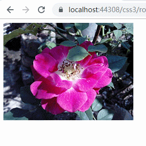
2. How to rotate image in css on hover
html code:
<div><img src="/images/rose.jpg" alt="How to rotate image in css on hover" class="rotateImgOnHover" /></div>
Css:
.rotateImgOnHover{ transition:0.2s ease-in-out; }
.rotateImgOnHover:hover{cursor:pointer; transform:rotate(180deg);}
Effect picture:
3. Css rotate background image only
html code:
<div>
<div class="rotatedBackgroundImg90"><div></div><span>Css rotate background image 90 degrees only</span></div>
<div class="rotatedBackgroundImg180"><div></div><span>Css rotate background image 180 only</span>
</div>
Css:
.rotatedBackgroundImg90{overflow:hidden;}
.rotatedBackgroundImg90 div{height:250px; width:250px; padding:6px;background-image:url('/images/rose-bg.jpg'); background-repeat:no-repeat; margin-top:10px; transform:rotate(90deg);}
.rotatedBackgroundImg90 span{display:block; position:relative; float:left; margin:-256px 0 0 68px; color:#ff0000; z-index:1;}
.rotatedBackgroundImg180{overflow:hidden; margin-top:10px;}
.rotatedBackgroundImg180 div{height:200px; width:267px; background-image:url('/images/rose-bg.jpg'); background-repeat:no-repeat; margin-top:10px; transform:rotate(180deg);}
.rotatedBackgroundImg180 span{display:block; position:relative; float:left; margin:-196px 0 0 8px; color:#ff0000; z-index:1;}
Effect picture:
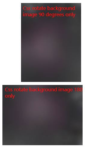
If you want to rotate 90 degrees counterclockwise, just change 90deg to -90deg, and so on.
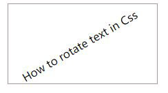
4. Css rotate text
html code:
<div class="rotateText"><span>How to rotate text in Css</span></div>
Css:
.rotateText{height:100px; width:200px; padding:8px; border:1px solid #ab9595; margin:10px 0 0 10px;}
.rotateText span{display:block; transform:rotate(-30deg); margin:40px 0 0 0px;}
Effect picture:
-
Related Reading
- Css dashed border, with dashed line, long dash borde
- Css page margin not working, with top, bottom, left,
- How to link up Css file in html for different mobile
- Scalez and Scale3d CSS example (scale in 3D space in
- Css Transition delay syntax and example, with hover
- Css transition background color highlight, gradient
- Css ul li no bullet and remove blank in front of the
- Css Translate examples, with box and text center hor