 Office > Excel > Excel 2019 > Content
How to make Excel chart with two y axis, with bar and line chart, dual axis column chart, axis range
If there are multiple columns of values in the table, especially in the case of percentages, it is usually necessary to make a dual axis chart, one Y axis represents the specific value, and the other Y axis represents the percentage in Excel. For example, to make a chart of product output and pass rate, one Y-axis represents the output and the other Y axis represents the pass rate.
How to make dual axis chart in excel? There are generally two ways to make a double Y axis chart, one is a combination of a column chart and a line chart, and the other is a combination of a column chart and a column chart; the former is relatively simple, and the latter often appears the problem of overlapping column bars needs to be separated and well spaced. Since the column bars belong to different Y axes, only adjust the "series overlap and Category distance" is not implemented, and a blank series placeholder needs to be added. In addition, the double Y axis can also set the coordinate axis scale and direction.
I, How to make Excel chart with two y axis case 1: Make a bar chart and line chart with two axis
If you want to make a dual Y axis chart of Production, Quantity Passed, and Pass Rate, one Y axis represents the Production and Quantity Passed, and the other Y axis represents the Pass Rate. The production method is as follows:
1. Insert a chart. Select any cell in the table(such as A2), press Ctrl + A to select the entire table, select the "Insert" tab, click the "Insert Column or Bar Chart" icon, and select the first "Clustered Column" under the "2-D Column" in the expanded style, the selected chart is generated from the data of table to be selected and moved to the right of the table; the operation process steps are shown in Figure 1:
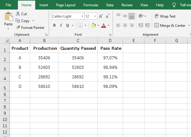
Figure 1
2. Change the bar that represent the "Pass Rate" to a line chart. Right-click the chart, select "Change Chart Type" from the pop-up menu to open the "Change Chart Type" dialog box. Select "Combo" at the bottom of the left, select "Pass Rate" for "Secondary Axis"(if the "Chart type" of "Pass Rate" is not "Line chart", click the drop-down list box to the right of "Pass Rate", and then select "Line chart"), and click "OK", then the Pass Rate" will be represented by a line chart; the operation process steps are shown in Figure2:

Figure 2
3. Modify the color of the line chart. Click the line chart to select it, select the "Format" tab, click the "Shape Outline"(with a pen) icon, and select a color in the pop-up color style, such as "Orange", the color of the line chart is changed to "Orange"; click the middle segment of the line chart to select it, expand the color style again, and select "red", then it becomes "red"; the operation steps are shown in Figure 3:
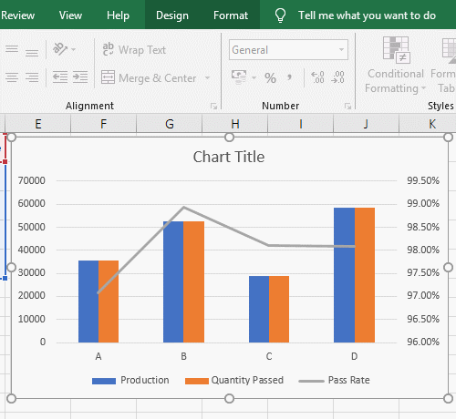
Figure 3
II, How to make Excel chart with two y axis case 2: Make a two axis column chart and avoids overlapping bars
(I) Only add the secondary axis blank series
1. Add a coordinate axis to the "Pass Rate". Because the values of "Production and Quantity Passed" are relatively large, and the percentage that represent the "Pass Rate" is small, so the column bar of the "Pass Rate" is not easy to select, but you can display the data label and then select the column bar by selecting the data label. Click anywhere on the chart, three icons appear in the top right of the chart, click the "Chart Elements"(that is, the plus sign) icon, and check the "Data Label" in the pop-up options, then the corresponding value appears on each bar; right-click one of the data labels represented by percentages and select "Format Data Series" from the pop-up menu, then open the "Format Data Series" small dialog box on the right side of the window, and select "Secondary Axis", the "Pass Rate" is represented by this coordinate axis; the operation process steps are shown in Figure 4:
Figure 4
2. Add two columns of "Pass Rate" and add them to the chart.
A. Click column number D, select column D, press Ctrl + C to copy, then select columns E and F, press Ctrl + V to paste the "Pass Rate" into columns E and F;
B. Right-click anywhere on the chart, select "Select Data" from the pop-up menu, open the "Select Data Source" dialog box, and change the "Chart data range" to =Products!$A$1:$F$5(that is, change $D$5 to $F$5, so add E and F columns), click "OK", then E, F columns are added to the chart and the secondary axis is automatically selected for them; the operation steps are shown in Figure 5:
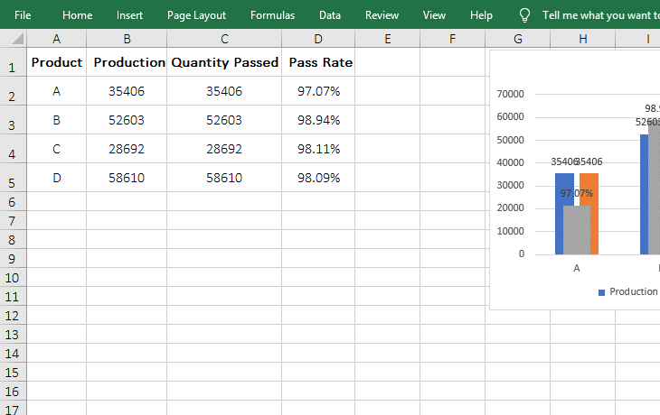
Figure 5
3. Disassemble the overlapping column bars.
A. Decrease the distance between the bars of the primary axis of the Y axis. Right-click one of the bars of the primary axis(such as the blue bar of "Products"), select Format Data Series" from the pop-up menu, open the "Format Data Series" dialog box on the right side of the window. The "Series Overlap" is changed to -20%, Press Enter, the distance between the bars of the primary axis of the Y axis becomes smaller;
B. Pull the right bar of the secondary axis (that is, the blue bar of the "Pass Rate") and the right bar of the primary axis(that is, the "Orange" bar of the "Quantity Passed") to separate distance. Select the gray bar of the "Pass Rate", change the "Series Overlap" to -100%, press Enter, change the "Grap Width" to 10%, and press Enter to separate the bars on the right of the two axes;
C. Adjust the gray column bar of the "Pass Rate" to the right. Right-click anywhere on the chart, select "Select Data" from the pop-up menu, open the "Select Data Source" dialog box, select the first "Pass Rate", click the down arrow to move it down to the end, and click " OK ", the gray bar is turned to the right;
D. Delete the auxiliary column. Select the columns E and F, press the Delete on your keyboard to delete them. The column bars are also deleted in the chart; the operation steps are shown in Figure 6:
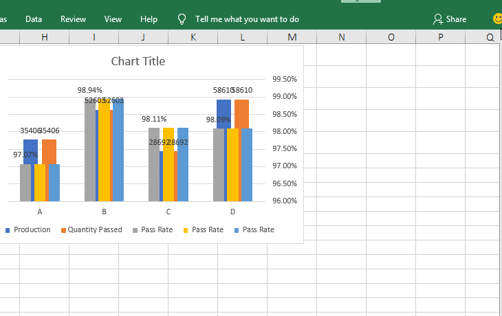
Figure 6
4. Adjust the color of the column bar and hide the legend of the deleted column.
Select the gray column bar, select the "Format" tab, click the "Shape Fill" icon, and select the "Light Green" in the pop-up color style, the gray column bar becomes light green; click "Legend" to select them, then click the "orange" box to select it, click the "Shape Fill" icon, and select "No Fill", then the "orange" box is hidden, and the blue box is hidden in the same way; the operation steps are shown in Figure 7:
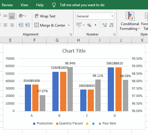
Figure 7
5. Separate overlapping data labels or hide them.
Select the data label of the "Production", click the "Chart Elements" icon in the top right of the chart, move the mouse over "Data Labels", then click the right arrow to the right of it, and select "center" in the expanded sub-options, then the "data labels" of all "Production" are moved to the middle of the bar, and the overlapping numbers are separated; click anywhere on the chart, click "Data Labels" to uncheck, all the values on the bar are hidden; the operation process steps, see screenshot in Figure 8:

Figure 8
(II) Add the primary and secondary axis blank series
Take one or more columns of the primary and secondary axes as auxiliary columns, for example, copy "Quantity Passed and Pass Rate", and paste them into columns E and F, add them into the chart, then adjust the "Series Overlap and Grap Width" of the primary and secondary axes to separate the overlapping bars. For the operation method, refer to the example above.
III, Set Excel axis
1. Set coordinate axis direction
Right-click under the X axis, select the "Format Chart Area" from the pop-up menu, open the "Format Chart Area" dialog box on the right, select the X axis, click the "End Arrow type" drop-down list box, and select an arrow(Such as the second from the left in the first row), then add an arrow to the X axis; select the right Y axis and select an arrow for it in the same way; the operating steps are shown in Figure 9:
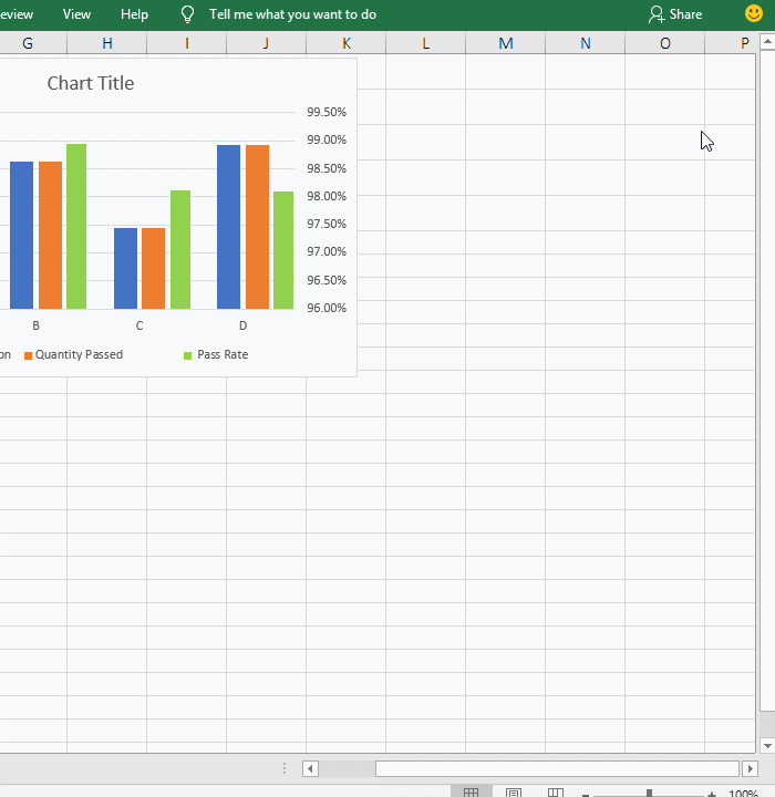
Figure 9
2. Excel chart set y axis range and scale
Right-click the Y axis on the right, select "Format Axis" from the pop-up menu, open the "Format Axis" dialog box on the right. "Minimum" is set to 0 and "Maximum" is set to 1. Click the "Axis Options "to fold it up; click "Tick Marks" to expand it, select "Outside" for "Minor Type", then the scale for the secondary axis are set; click the "Number" to expand it, enter 0 for the "Decimal places", press Enter, the "label" of Y axis does not round the number of decimal places; the operation process steps, see screenshot in Figure 10:
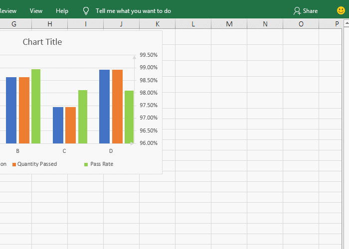
Figure 10
-
Related Reading
- How to move rows,columns,cells,table in excel(there
- How to subtotal in excel, with two fields, copy, sor
- Combine multiple excel sheets into one pivot table w
- How to create a pivot table in excel(15 examples, wi
- Excel pivot table percentage of grand total(parent r
- How to make a table of contents in word and change,
- How to convert excel to pdf(6 examples, with selecti
- How to make an excel spreadsheet, with the top 10 kn
- How to generate multiple reports from one pivot tabl
- How to use advanced filter in excel(7 examples, mult
- How to filter in excel(16 examples, with number,text
- Excel SumIf function with ?/*, Average and array mul