 Office > Excel > Excel 2019 > Content
How to create a chart in excel(18 examples, with add trendline, gridlines, data labels overlap)
You can make a table into a chart in Excel, for example, make a monthly sales result in different years into a chart, so as to achieve an intuitive comparison of sales performance in the same month each year. When making table data into a chart, sometimes the rows or columns of the data may not meet the requirements for making a chart, and corresponding adjustments need to be made, especially when there are many categories.
After making the table data into a chart, you can display numerical values, trendlines, error bars, and gridlines. If you encounter text that is not easy to read under horizontal X axis, you need to display them vertically, horizontally, or diagonally; if the numbers on different column bars are overlapped together, which is inconvenient to read and need to be separated; if the chart style does not meet the requirements, you need to adjust the color or change the style; in addition, add new data to the chart after adding data.
I. How to create a chart in excel
(I) How to insert chart in excel(eg. How to make a bar chart in excel)
1. Take the production performance chart as an example. Select any cell in the table, press Ctrl + A to select the entire table, select the "Insert" tab, click the "Insert Column or Bar Chart" icon, and select the first "Clustered Column" in the pop-up style, the preview chart is generated on the right side of the table, click once to generate a clustered column chart from the table data and move it to the right side of the table. The operation steps are shown in Figure 1:
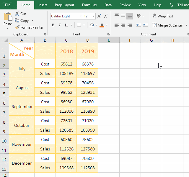
Figure 1
2. There are different years and months in the table. Each month is also divided into "Cost" and "Sales". Therefore, you must make the table the style in the deme, otherwise you cannot generate the "Cost" and "Sales" in the same month in different years on the X axis.
(II) Adjust chart
1. Modify the title of chart. Click on "Chart Title" to select it, then click on the text to position the cursor inside it, press Ctrl + A to select all the text, and copy the "Cost and Sales for the second half of 2018-2019" into it(you can also directly enter the chart name), then the chart title is modified; the operation steps are shown in Figure 2:
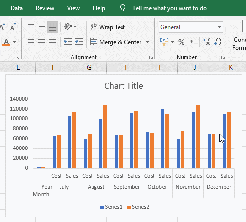
Figure 2
2. Hide the field "YearMonth" and modify series. right click the chart, select the "Select Data" in the pop-up munu, ope the "Select Data Source" dialog box; click the "YearMonth" to uncheck; select the "series 1", click "Edit", open the "Edit Series" dialog box, enter 2018 for the "Series name", press enter, change the "series 1" to 2018; select the "series 2", change it to 2019 in the same way. the operation steps, see screenshot in Figure 3:
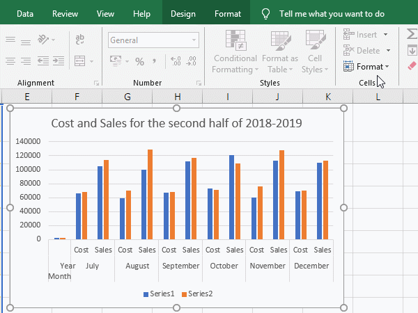
Figure 3
3. Display the text under X-axis as horizontal, Vertical or oblique. Right-click the X axis, select "Format Axis" from the pop-up menu, open the "Format Axis" dialog box on the right side of the window, select the "Size and Properties" icon(the second from the right), and click the "drop-down list box" on the right of the "Text Direction", select" Vertical "in the pop-up menu, then the text "Cost and Sales "under the X axis are show vertically; click this drop-down list box again and select" Horizontal", enter 30 to the right of "Custom angle", press Enter or click elsewhere, then "Cost and Sales" is displayed obliquely; operating process steps, as shown in Figure 4:
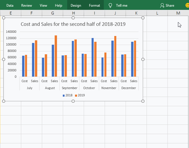
Figure 4
II, The basic operation of Excel chart making
(I) Chart elements
1. Data label
A. Click the "orange" column bar, click the "Chart element" icon in the top right of the chart, click "Data labels" to check it, then the "Sales" value will be displayed above the selected column bar, click "Data Labels" to uncheck; click any blank area of the chart, and then check "Data Labels" again, the values will be displayed on all the bars; the operation steps are shown in Figure 5:
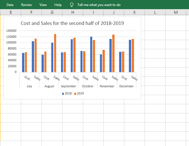
Figure 5
B. Adjust the thickness and overlap(or distance) of the bar. Right-click the value on the bar, select "Format Data Series" from the pop-up menu, open the "Format Data Series" small dialog box on the right side of the window, and change the value of "Series Overlap" to 27%, press Enter, the blue column bars overlap with the orange column bars(the overlap is 27%); and then change the value of "series overlap" to 57%, the blue column bars and the orange column bars leave; the "Gap Width" to 1197%, the column bars have been thickened; the operating process steps are shown in Figure 6:
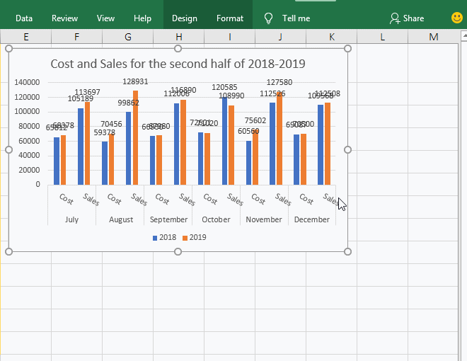
Figure 6
C. Change the shape of the data label. Right-click the data label whose shape you want to change, select "Change Data Label Shapes" in the pop-up menu, and select a shape(such as "Speech Bubble: Rectangle") in the expanded shape styles. The outer frame of the selected type of data becomes Selected shape; operation process steps, see screenshot in Figure 7:
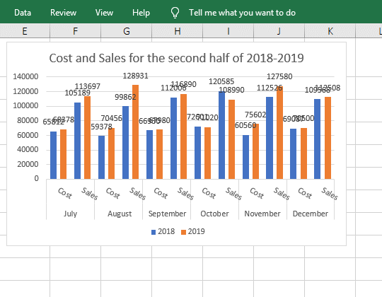
Figure 7
D. Excel chart data labels overlap. Adjust the position of value to separate the overlapping values. Right-click the value of the blue column(that is, the value below the value of orange column), select "Format Data Labels" from the pop-up menu, open the "Format Data Labels" small dialog box on the right, and select "Center" for "Label Position", then the selected values are moved to the middle of its bar, and separate the overlapping values at the same time. Check the "Series Name" under "Label Contains", drag one of the values to the blank, and add a year 2018 before the value, indicating the "Series Name" here refers to the "column" year, and then check the "Category Name", "July Cost" is added after 2018, indicating that "Category Name" means "Year + Cost or Sales". The operation process steps are shown in Figure 8:
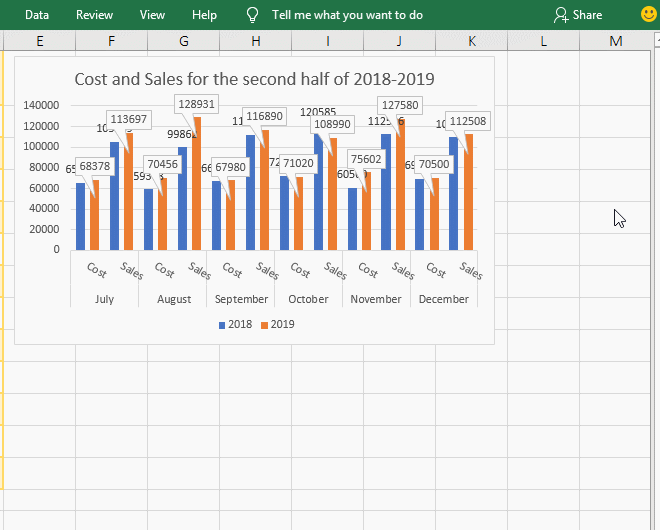
Figure 8
The shortcut keys used for the operations above are:
The shortcut keys of opening the "Format Data Series" dialog box: Shift + F10 + I, the key method is: select the value, press Shift + F10, and then press I;
The shortcut keys of changing data label shapes: Shift + F10 + C, the key method is: select the value, press Shift + F10, and then press C;
The shortcut keys of opening the "Format Data Labels" dialog box: Shift + F10 + F + F, the key method is: select the value, press Shift + F10, and then press F twice;
2. Data Table, error bars, gridlines and legend.
A. How to add data table to excel chart. Click anywhere on the chart to select it, so that three icons appear in the top right of the chart, click the "Chart Elements(that is, plus sign)" icon, and check "Data Table" in the pop-up options, then the specific values of "Cost and Sales" for each month in different years appear under the X axis, the large numbers are expressed in scientific notation. Click the rihgt arrow to the right of "Data Table", the "With Legend Keys" is selected by default in the expanded sub-options, Select "No legend Keys", the blue and orange squares on the left of the X axis are gone, and then select "With Legend Keys" again, these two boxes appear again, indicating that the "Legend Keys" is used to correspond to data and columns bar. The operating process steps are shown in Figure 9:
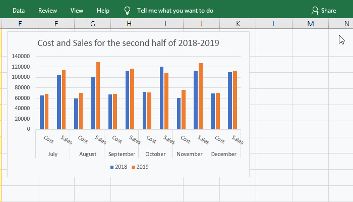
Figure 9
B. Excel add error bars to bar chart. Check "Error Bars", an error bar of "I" shape appears on each column bar, click the right arrow to the right of "Error bars", there are three options, which are "Standard Error, Percentage and Standard Deviation", you can represent errors in these three ways. The operation steps, see screenshot in Figure 10:
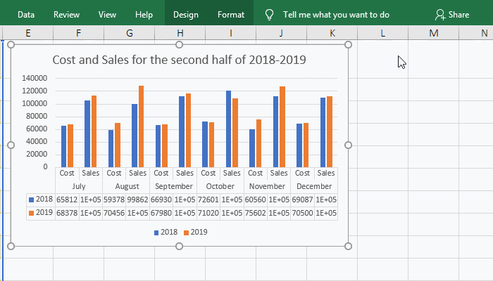
Figure 10
C. How to add gridlines to excel chart. Check "Gridlines", the horizontal gridlines appears in the chart, then click the right arrow to the right of "Gridlines", check "Primary major vertical" to display the vertical gridlines. There are also "Primary horizontal and Primary minor vertical", the former refers to the horizontal line connecting the small scale between the two major axis scales of the Y axis(like millimeters between centimeters on a ruler), for example, there are four small scales from 0 to 20000 on the Y axis, connecting the four small scales is the secondary horizontal gridline of the primary axis; the latter refers to the vertical line between the two columns of "Cost and Sales". The demo is shown in Figure 11:
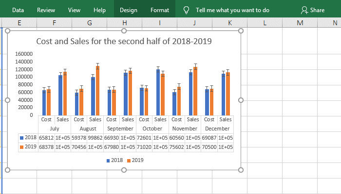
Figure 11
D. How to add legend to excel chart. Click "Legend" to uncheck, then 2017 and 2018 and the small squares before them at the bottom of the chart are gone, indicating that the legend refers to them; check the legend again, they appear again. Click the right arrow to the right of "Legend", you can place the "Legend" on the left, right, top, and bottom of the chart, select the left, they are displayed to the left, and select "bottom", they are displayed to the bottom; the operating process steps are shown in Figure 12:
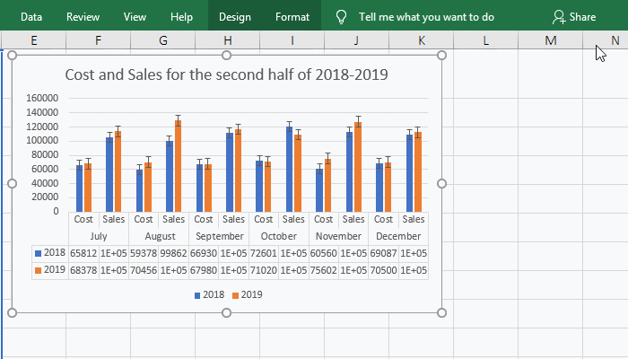
Figure 12
3. How to add trendline to Excel chart
Select the chart, click the "Chart Elements" icon, check the "Trend Line", pop up the "Add Trendline" small dialog box, select 2018, click "OK", then add a trendline to "Cost", select the trendline , Click the right arrow to the right of "Trendline", and select "Two Period Moving Average" in the pop-up options, the trendline will change to the selected style; click any blank space outside the chart to close the option, and then select the trendline on the chart, press delete on the keyboard to delete it; the operation steps are shown in Figure 13:
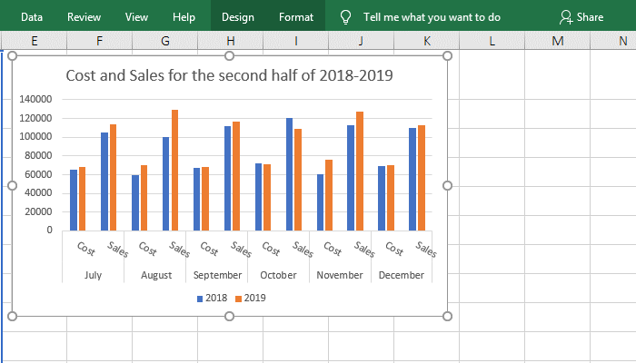
Figure 13
(II) How to change chart style in excel
Select the chart, click the "Chart Styles" icon in the top right of the chart, and select a style from the pop-up styles, such as the second, the chart applies the style; select the "Color" tab, select a color, such as the third type under "Colorful", the column bar of the chart changes to the selected color; the operation process steps are shown in Figure 14:
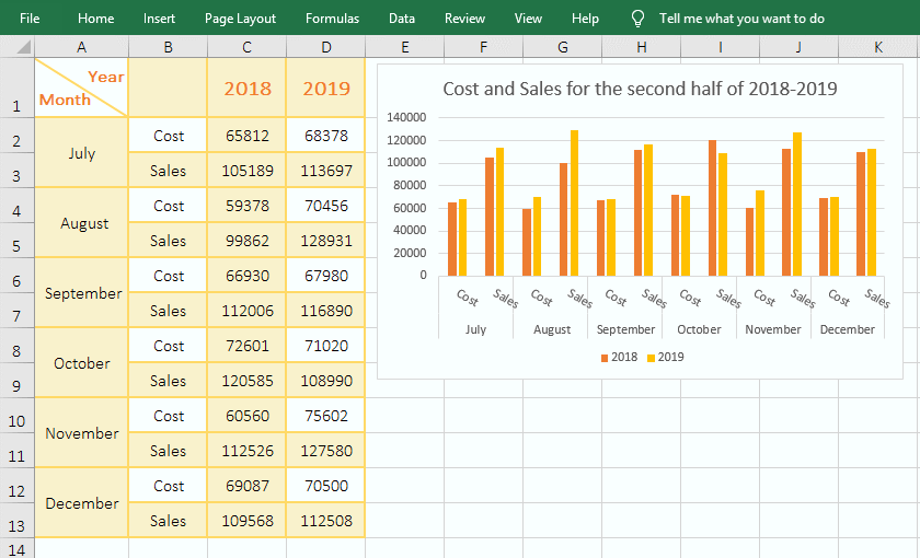
Figure 14
(III) How to apply chart filters in excel
1. Values. Select the chart, click the "Chart Filters" icon, the current tab is "Values", uncheck 2018 under "Series" and "July Cost" under "Categories", click "Apply", then the data for 2018 and the "Cost" of July 2019 are gone; the "Series" refers to the annual data and "Category" refers to an item in a series, you can check what you want to display. The operation steps are shown in Figure 15:
Figure 15
2. Names. Select the "Name" tab, select "None" for "Series", select "Column B" for "Categories", and click "Apply", then the series 2018 is gone, and the series 2019 is also changed to "Series 2", The "month" under X axis is also missing because "column A" is not selected for "categories"; the operation steps are shown in Figure 16:
Figure 16
III, Update chart after modifying data in Excel
(I) Update chart after adding and deleting rows
Select rows 12 and 13 and right-click them, select "Delete" from the pop-up menu, the selected two rows will be deleted and the chart will automatically delete the data in December. Then the deleted data will be copied back, they does not be automatically added in the chart. Right-click the chart and select "Select Data" from the pop-up menu to open the "Select Data Source" dialog box, change the "Chart data range" to = Sheet1!$A$1:$D$13(that is, change $D$11 to $D$13), press "Enter" to add the data in "December" to the chart; the operation steps are shown in Figure 17:
Figure 17
The legend 2018 and 2019 are automatically restored the "Series 1 and Series 2" after adding the new data into the chart in Excel 2019, you need to change them to 2018 and 2019 again. The field "YearMonth" is the same.
Tip: After adding a new column, Excel will not automatically add the new column to the chart. To add it to the chart, the method is the same as after adding a new row, that is, modify the "chart data source".
(II) Update chart after deleting columns
Right-click column number D, select "Delete" from the pop-up menu to delete column D. At the same time, it pops up a dialog box prompting a reference error, click "OK"; the data in the column to be deleted are gone; the operation steps are shown in Figure 18:
Figure 18
Tip: If the legend of the deleted data becomes #REF!, right-click the chart and select "Select Data" from the pop-up options, open the "Select Data Source" dialog box, select #REF!, click "Remove", delete it, and then "OK", the reference error #REF! in the chart will be deleted.
-
Related Reading
- How to move rows,columns,cells,table in excel(there
- How to subtotal in excel, with two fields, copy, sor
- Combine multiple excel sheets into one pivot table w
- How to create a pivot table in excel(15 examples, wi
- Excel pivot table percentage of grand total(parent r
- How to make a table of contents in word and change,
- How to convert excel to pdf(6 examples, with selecti
- How to make an excel spreadsheet, with the top 10 kn
- How to generate multiple reports from one pivot tabl
- How to use advanced filter in excel(7 examples, mult
- How to filter in excel(16 examples, with number,text
- Excel SumIf function with ?/*, Average and array mul